Air conveyance is becoming an increasingly perspective business for investors. Not surprisingly, the increase in demand aggravates competition among market players. As a result, in the market, we see a virtual war of brands for potential passengers. Let’s look at the example of the two giant airlines and what successful moves do marketers invent to achieve their goals.
Air Transport Marketing: American Airlines
American Airlines is the world’s largest air conveyor. In 2016 more than 201 million passengers took advantage of the airline’s services. With the company’s logo flies more than 1270 aircraft. Despite the fact that American Airlines was ranked among the three most expensive brands of airlines with $ 4.8 billion, they had to settle for a modest 74th place in the ranking of the world’s best airlines in the world in 2017 according to Skytrax.
Tagline
The slogan of any company reflects the philosophy of the brand. Slogans of American Airlines in different marketing strategies performed such tasks:
The positioning of leadership and superiority. “The leading (local) airline of America”, “We, American Airlines, do what we do best”, “Founded here. The best here”.
The emphasis is on expanding and enlarging the company. After the merger with TWA, American Airlines launches the slogan “Two big airlines, one big future”. The modern slogan of the airline “Coming New American” appeared after the merger with US Airways.
Territorial attachment and reference to patriotism. “Fly in American”, “No other airline will give you more America than American”, “It’s good to know that you are on American Airlines”, “We are an airline that is proud to be called American”. The appearance of the last one became a reaction to the tragedy of September 11, 2001: two of the four terrorists captured by airliners belonged to American Airlines.
Separately, it should be noted the slogan “The On-Time Machine”, which was used in the 80’s. It is also read as “on the time-machine”. Thus, the brand is positioned as ultra-modern and focused on new technologies.
But first of all, the incredible popularity of fantastic films in the USA in the 1980s should be taken into account. In the highest grossing films of those times (“Star Wars”, “Terminator”, “Back to the Future”, “Flight of the Navigator”, etc.), the action takes place in the future, or the story is tied to time travel.
Therefore, such a game of meanings in the slogan can be considered very successful. The reference to “Star Wars” is also read in the musical accompaniment of the American Airlines commercial of 1988.
Logotype
The first American Airlines logo was created in 1934. Its main element was the attacking eagle. If we trace the evolution of the logo, then noticeably a decrease in the detail of the image of the eagle in each new version.
![]()
At the moment the most famous American Airlines logo is the project developed by the designer of 1967 Massimo Vignelli. The composition of the letters “AA” and the eagle on the top visually resemble a pyramid. One of the symbolic values of the triangle is the relationship of the ground to the sky. The triangle also symbolizes persistence, leadership, and movement up. All these associations fit well into the image of a stable and actively developing company.
The symbol of the eagle in the logo of American Airlines carries three vital messages:
1. The national symbol of the USA. The eagle in the logo is depicted in an attack pose, symbolizing strength and determination.
2. The bird is associated with flying. That’s why images of birds are most often found in the logos of airlines. Since the eagle is considered the king of birds and the lord of the sky, the American Airlines logo also reads the airline’s desire for leadership in the airspace.
3. The eagle is a symbol of speed, sure achievement of purpose.
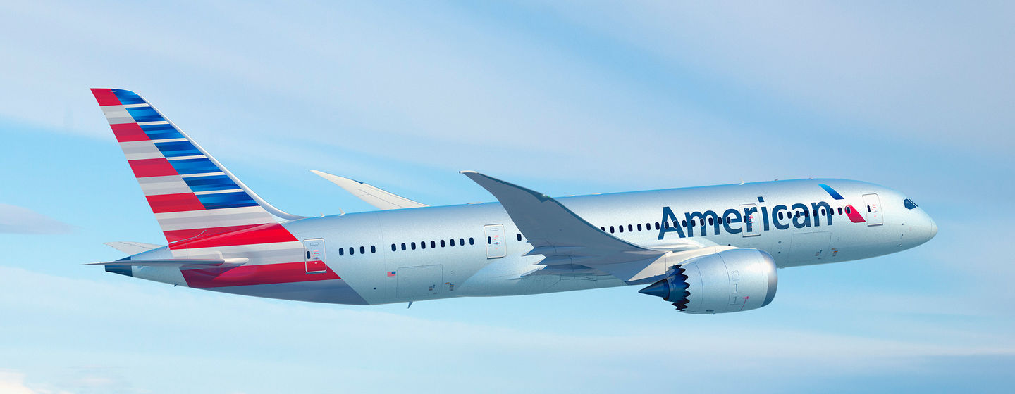
In 2013, during a merger with US Airways, American Airlines conducted a rebranding. Eagle in the new logo lost its aggressiveness and is now perceived as a symbol of dynamism and progressiveness. According to the company’s commercial director, Virata Vahidi, the new logo, and livery “symbolize the thirst for success and the soaring spirit inherent in Americans.”
Livery and corporate identity
Before rebranding, American Airlines planes had a polished metal fuselage with blue, white and red stripes under the portholes. The logo was traditionally located on the tail of the airliner.
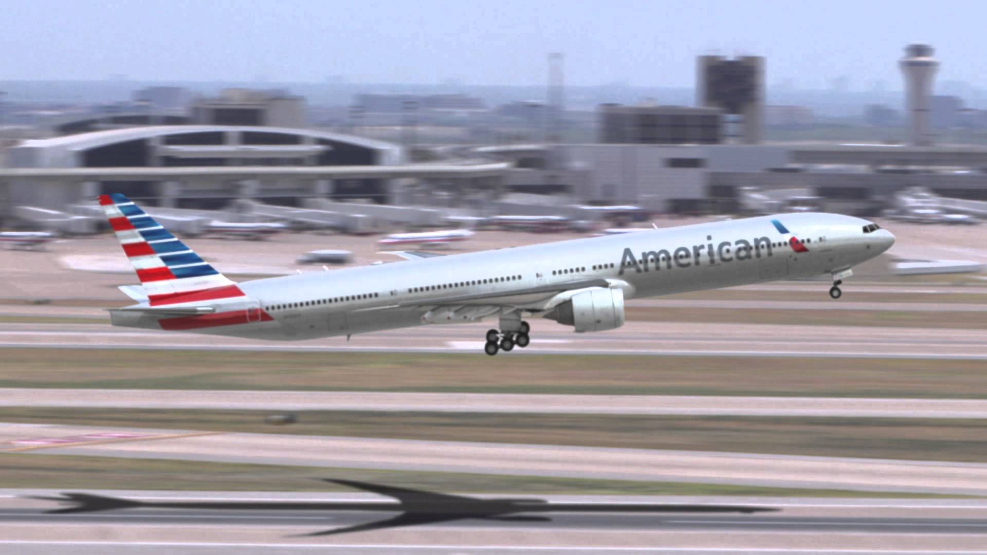
January 31, 2013, began with the presentation of a new Boeing 777-300ER aircraft, made of composite materials. It is difficult to give them a metallic luster, so the change of livery was more of a forced step.
In the new livery, the airline’s name and the logo following it are located in the bow – between the wing and the cockpit of the pilots. The tail is decorated in the style of the American flag, and the fuselage is painted white, traditional for most airlines.
Retro livery
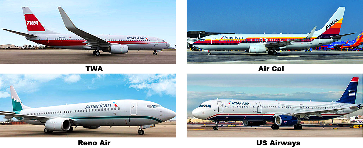
At the airports, you can sometimes see “planes from the past.” Liveries that were popular dozens of years ago are used for the coloring of some of them. Retro-livery, that flaunts the new logo, shows the rich tradition of airlines and the connection of generations. Do not bypass the airline attention and liveries of the absorbed brands. This move allows us to show respect for the traditions of former competitors and at the same time demonstrate the power of the airline that has absorbed them.
In retro-livery, airlines primarily play on consumer nostalgia. It’s nice to get on an airplane outwardly reminiscent of the one on which the young people flew on a honeymoon or on a university vacation. Such attention to the consumer’s feelings contributes to a positive perception of the brand.
With the takeover of US Airways, the company received not only assets but also the practice of using retro-livers for aircraft registration. American Airlines fleet replenished with Boeing 737 airliners in the livery of the operator Air Cal and several other airlines: Reno Air, Trans World Airlines, and US Airways.
Stewards uniform
In September 2016, air and ground personnel of American Airlines received a uniform. It consists of a dark gray suit, a tie for men and a neck scarf in branded colors of the airline for women.
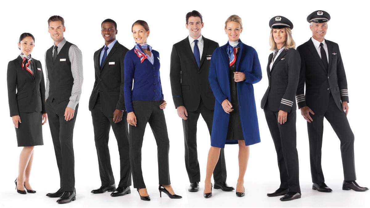
Before that, the airline employees wore the uniform of the 1980 model, and the stewards of US Airways were wearing the uniform of their former company.
British Airways: marketing of airlines in English
It was established in 1974 on the basis of large airlines – BOAC and BEA and two smaller regional air carriers.
In the 2017 Skytrax rating, the airline took 40th place, and also was on the 9th position in the list of the largest air carriers of the world.
Tagline
From the day of its foundation, British Airways management has relied on the world leader in the air transportation market. Under this strategy, the slogan “The World’s Favorite Airline” was developed. This phrase was also used in the variant “The best airlines in the world”.
Such slogans were used in advertising companies also:
“Update/upgrade to British Airways” (call to action, positioning the company’s modernity);
“Fly under the flag” (appeal to the patriotic feelings of the British and the emphasis on the new livery);
“We will give you even more care” (promise to the consumer).
In 2011, the main advertising phrase of British Airways was “To Fly. To Serve.” A special logo was developed for the new slogan, that was stylized as Great Britain coat of arms. The essence of the new concept of brand positioning is clearly visible in the commercial of British Airways. You do not even need to know the English language in order to follow in advertising the emphasis on the rich traditions and reliability of the airline.
Logo and livery
As already mentioned, British Airways united four airlines. The most popular brands were from BOAC and BEA.
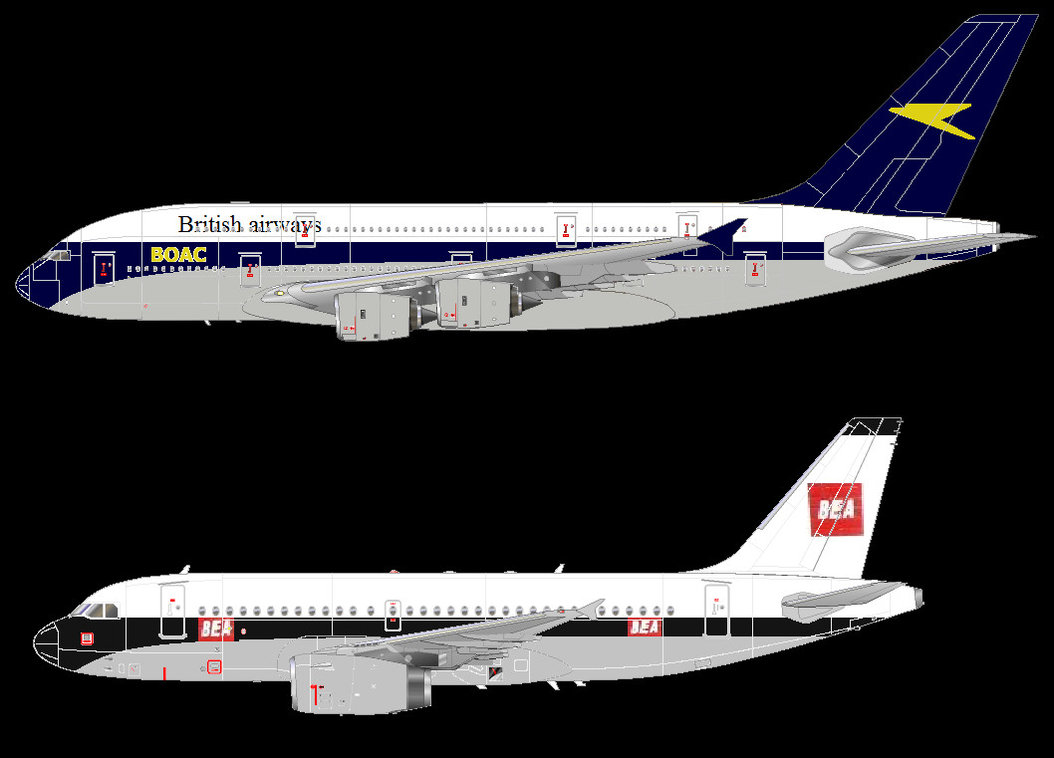
When discussing the development of a unified corporate identity of British Airways, BOAC employees of the company stood up for the protection of their brand. A campaign was organized to protect the “bird” – the symbol of the airline. Therefore, the first brand was the inscription “British Airways” in the colors of the national flag of Britain. It was simply applied to aircraft livery by airlines that entered the “BA”.
![]()
If you look closely at the logo of 1984, the red line under the inscription also looks like the BOAC logo. In a more rounded form, the “bird” also entered the logo that British Airways enjoys today.
In the livery of British Airways of different times, it’s hard not to notice the influence of BOAC and BEA marketing specialists on the British Airways brand.
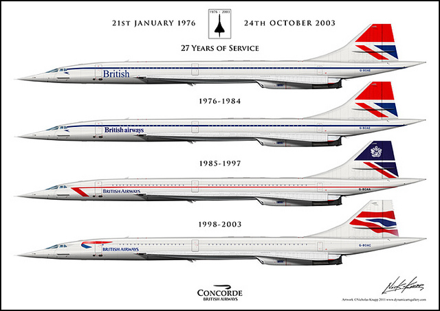
“Birdie” appears on the nose of the fuselage, and in the sharp coloring of the tail reads the BEA logo. The dark purple color, in which the planes of these airlines were painted, before the rebranding of British Airways in 1997 becomes the color of the company’s livery.
Unsuccessful experiment
In 1997, British Airways marketers, considering that there were more than half of the foreigners among the airline’s clients, decided to position themselves not as British, but as global airlines. So ethnic designs of the countries in which the airliner flew were applied to the tail section of the aircraft.
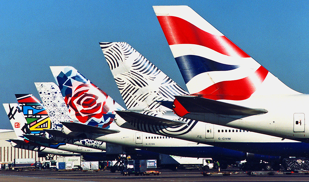
This marketing strategy of the airline caused a flurry of criticism in the UK. Â Margaret Thatcher has most eloquently expressed the position of the British. At the presentation of the project of new liveries, she covered the tail of the model with her handkerchief, while saying: “We fly under the British flag, and not under these terrible things.”
The British Airways market experts immediately checked with competitors from Virgin Atlantic. They put the British flag on the vertical endings of their aircraft. Also on the nose was an image of the Virgin symbol “Lady Scarlett” in a dress fluttering the British Union Jack, and the inscription “Bearer of the British flag.”
Ethnic livery flattered foreign passengers. However, the consumer of any country is accustomed to seeing the colors of the flag on national airplanes. Therefore, there was a certain dissonance between the brand name and the livery. If you position the company as a global company, then together with the use of ethnic-liveries, you should conduct a renaming of the company itself.
The idea of ethnic livery did not appeal to air traffic controllers, who found it more difficult to determine British Airways planes on approach to the airport. Therefore, ethnic liveries, not having lived four days before their two-year anniversary, were replaced by the British flag.
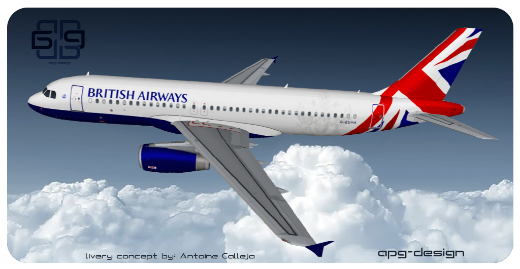
An interesting British Airways livery project, which Mrs. Thatcher would have liked, was designed by the designer Antoine Calleja.
Stewardesses
British Airways stewardesses have always been considered a model of style. Their uniform changed in the light of fashion trends, developed by famous fashion designers. In the museum of the airline, visitors can admire the uniforms of British Airways stewardesses.
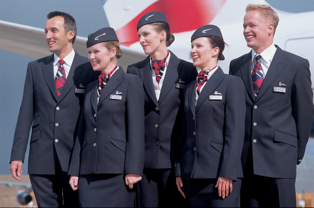
The modern form of flight attendants stores the traditions of the airline. The coloring of suits, ties, and neckerchiefs is a tribute to BOAC, and British Airways inherited the design of the badges from British European Airways.
The brand can be compared with a complex mechanism. Every detail must be manufactured and tuned in such a way that the mechanism works like a Swiss watch. The malfunctioning of the brand will have more serious consequences than the malfunctioning of the processing lines. After all, if in a technical mechanism the replacement of a part allows you to quickly resume the production process, then the brand is much more complicated – often you have to redo the entire mechanism.
In branding, the detail can look beautiful (a capacious slogan, a beautiful corporate color), but not work for a particular brand, being for it as useless as the detail of an automobile engine in an airplane.