
A logo creation is an extremely difficult process that takes lots of your efforts. Different logos are connected by a common feature: their audience. Thus, there are some logos that turn to be really special not because of their content but because of their audience. These are logos aimed at kids.
Aligutierrez59, a designer who competed in DC’s contest for a Pediatric Dentistry logo and won a bronze medal, said it didn’t matter for him whether the contest was aimed at kids or adults, he was simply focusing on his customers’ requirements. Therefore, the logo he designed for the contest looked smart and playful at the same time and could satisfy both grown-ups and kids.
Here, it was the first time we asked ourselves a question: Do logos aimed at kids differ from those aimed at adults? In order to find that out, we decided to ask more designers from our platform who won the logo contests aimed at kids: what is really special about this kind of logos? Their answers really impressed us, which is why we share these answers with you and guarantee you will find out lots of new and inspiring things, no matter whether you are a client, a designer or just a passer-by.
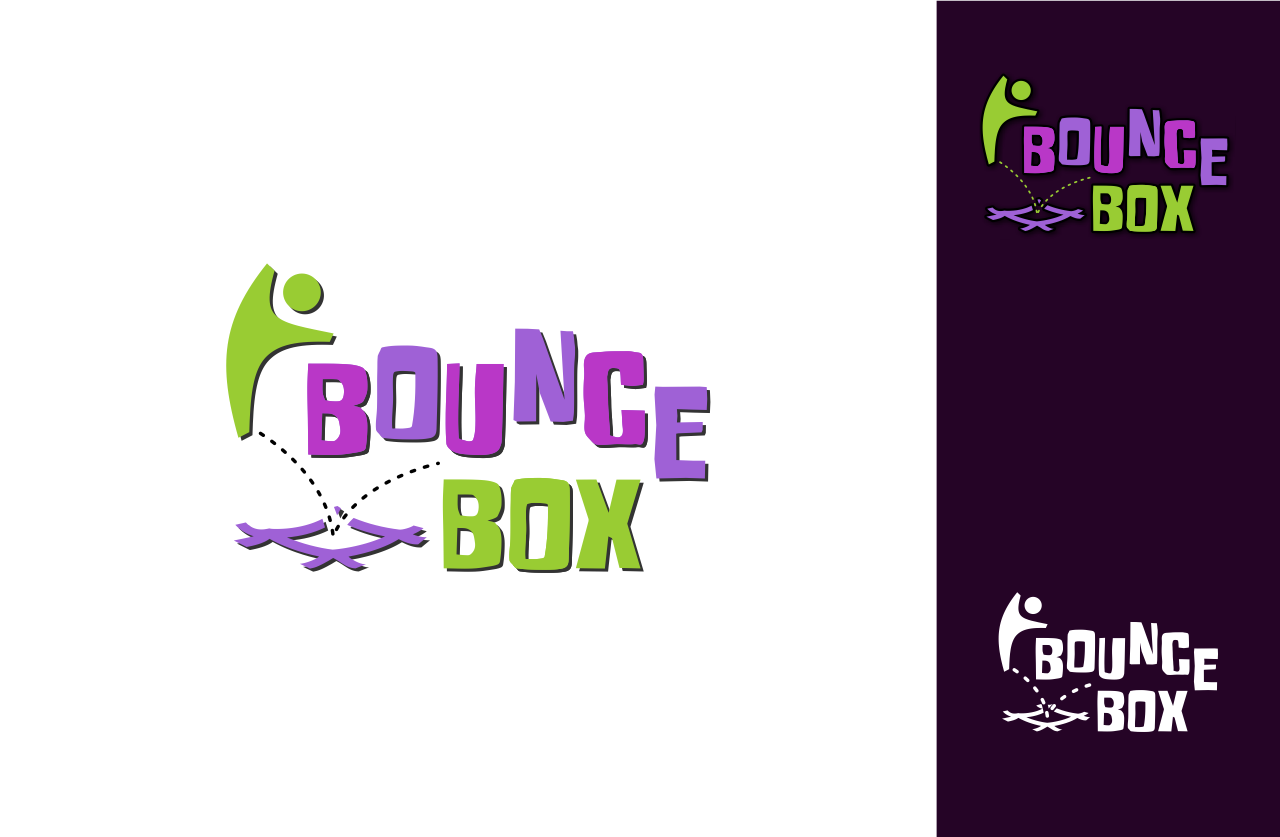
Bounce Box
A winning logo for a Bounce Box contest, created by our marvelous designer Savina, differs by its vivid concept and a wide space for our imagination. It’s active, entertaining and unique and should be loved not only by adults but also by kids.
- Savina, what is harder for you: creating logos for a business aimed at kids or at adults?
I wouldn’t say harder, for me it’s more fun to create designs aimed at kids.
- What is the best way to win a contest on DesignContest, based on your experience with Bounce Box?
For a logo contest, you have to understand what exactly the contest holder’s business is about, realize his target and find what’s needed to present it in the best way. For Bounce Box I thought the name doesn’t make it clear what the company is about, therefore I showed it in the logo.
- For Bounce Box, you had to stick to some precise neon colors. Do you like it when you’re restricted in terms of colors, typography etc. or does it appeal to you more when you can choose everything on your own?
Here it’s reasonable to use such colors, all trampoline parks I saw are like this. CH has some concept for interior design and wants the logo to fit. It’s about kids and fun and energy, I think the colors I used are the best. Actually, they are not exactly what he wanted 😉 Usually I don’t care much about the exact colors or such restrictions, I offer what I believe is best and if the CH further insists on the usage of his colors or other stuff, I try to show him why my ideas are better.
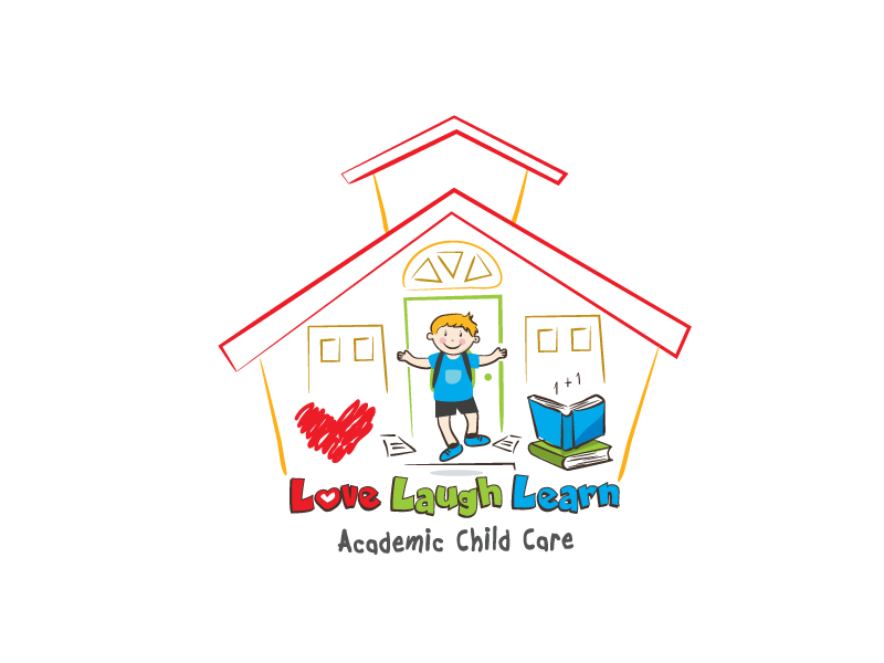
Love, Laugh, Learn – Academic Child Care
The logo for The Academic Child Care created by one of DesignContest’s most active and unique designer, Operhal, is warm, light and extremely original. It contains love inside, thus it cannot be left unnoticed.
Operhal, what is harder for you: creating logos for a business aimed at kids or at adults?
Well, I really enjoy creating logos for businesses aimed at kids. There are much more possibilities in a kids logo design. You can let your imagination run free 🙂
What is the best way to win a contest (based on your experience with Love, Laugh, Learn – Academic Child Care)?
I really liked that contest! My client was nice, truly involved in a designing process, the brief was great and the client knew what he liked. 🙂 That is really important if you run a contest on DC. After I won that contest I had an opportunity to work with him on 1on1. The best way to win a contest is understanding the brief (if there is a proper brief written 🙂 and being original. Besides that, you will need some luck 🙂
What are the biggest complications of hand-written logos?
That would be a minimal logo size. Logos with hand-written fonts tend to be unreadable in smaller sizes. You should pay attention to that, try to use more spacing between the letters and always check how the logo will look like, for example, printed on a business card. Try to define the minimal size of the logo. If is not good on a small size, try to change a font. Furthermore, it is always good to have both horizontal and vertical logo versions.
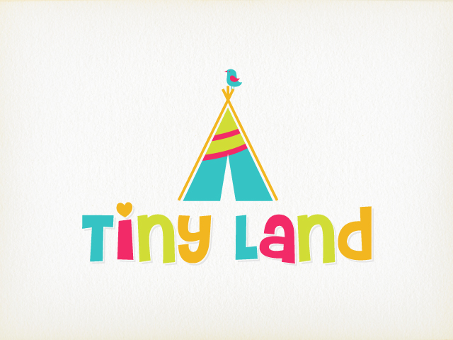
TinyLand
This bright and catchy logo designed by talented EcoDesigns for the company Tiny Land inspires you to be in a playful mood, even if you’re no longer a kid.
EcoDesigns, what is harder for you: creating logos for a business aimed at kids or at adults?
I feel one is not harder than the other. Aiming for a logo for kids doesn’t make it easier and vice versa. To me, each logo requires the same thought process and brainstorming. I yearn for the same quality and client satisfaction for logos aimed at both kids and adults.
What is the best way to win a contest on DesignContest, based on your experience with Tiny Land?
Reading the contest’s description and having a good understanding of client’s requirements is the key to connecting with the client. Following up questions in comments, as well as coming up with original mockups are two things most clients appreciate. Original designs also give one a better chance to stand out in the crowd.
In the creative brief for Tiny Land, your clients specified they wanted to see a cartoon wild animals on their future logo and most of your competitors made an elephants, bunnies, bears and even squirrels. Why did you choose the opposite way?
In the contest description, the client mentioned that their focus was on play tent & teepee for 2-7 years old kids. This was my main focus, too. Coming up with a design that focuses on attracting a 2-7 yr old kid, as they are the target audience here. The client was very clear about the requirements and asked for an animal to be included. But I looked at the logo examples they provided and cumulatively came up with something that is a blend of a vivid, bright, colorful logo that has a hint (little birdie) of an element that the client requested (an animal) without making it overpowering.
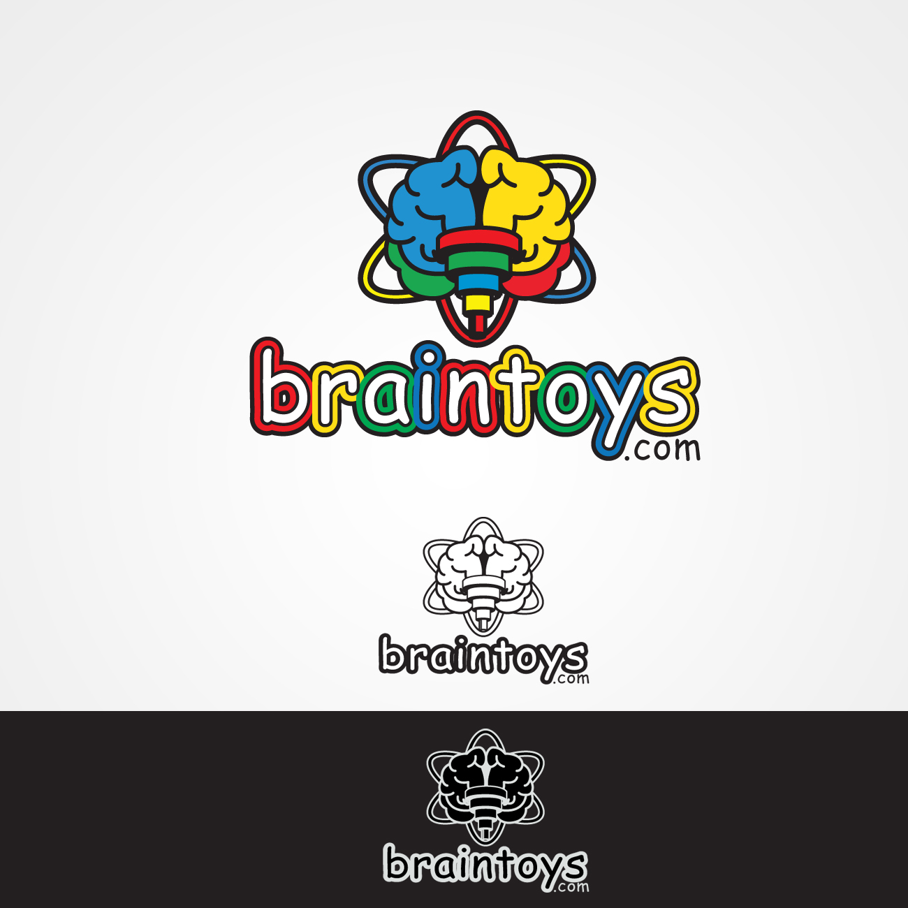
Braintoys.com
A stunning logo created by Creatica for braintoys.com is so delightful and captivating it cannot leave you indifferent.
Creatica, what is harder for you: creating logos for a business aimed at kids or at adults?
I like every kind of graphic design – especially logos. Kids aimed business designs are more colorful, that’s why I can use fuzzier or funnier design. On the other hand, this kind of design could be hard if you want to create a simple and very sophisticated design. Adults aimed business designs – it could be only my opinion – exist in a much bigger market. I think it could be much easier to create something that Client will like, but also it could be very similar to other designs. You always need to check it twice 🙂
What is the best way to win a contest on DesignContest, based on your experience with braintoys.com?
I think the best way is to be original and helpful for Client. It really works. Of course, you need some luck, but it’s much easier to be simply a professionalist. I think that winning the contest for braintoys.com was the result of a good conversation with Client and a submission of original designs.
What was the hardest thing in a logo design for the company braintoys.com?
The hardest thing in this contest was to make it work with colors that Client wanted. There was an expectation that there had to be colors for kids, but on the other hand, they had to be intensive as well. Within some conversations, we chose one color palette and here we are 🙂
Laurance McGraw
Last but not least is the logo designed by unbelievably comprehensive Hollander for Laurance McGraw. This logo is a real cherry on top and can be added to logo design textbooks for its perfect and spotless execution.
![]()
Hollander, what is harder for you: creating logos for a business aimed at kids or at adults?
It’s obvious that logos aimed at kids are much more complicated. Except for an adult who is going to evaluate the logo’s quality and elegance, there is also a kids’ audience. Kids are much harder to please; their psychology and attitude are absolutely different. A kid will either accept the logo or it will be a complete failure. If we’re speaking about characters, you cannot do with a single knowledge of an illustrator, you need to be a real artist. Abstraction or smart forms of “grown-up†logos won’t do. There has to be a clear message, in a beautiful, kind and simple way, just like in the real life of adults and kids.
What is the best way to win a contest on DesignContest, based on your experience with Laurance McGraw?
In this particular contest, there was a clear task described by a client. There were logos’ examples along with his book’s illustrations. There was some kind of difficulty in terms of graphics, but, following the client’s wishes, it was quite easy to overcome. Unfortunately, a good brief doesn’t grow on trees nowadays, but if you do have one, you need to study it carefully in order to grasp what your client wants; thus, you will be a halfway towards success.
What is the peculiarity in terms of creating a character for a logo?
Characters for a logo, to my mind, belong to the highest league. Here you need to be an artist, the best one at what you do. This is a very specific product and not every client percepts it. However, as a rule, if a client wants a character, he already imagines the way it should look. And here, except for artistic skills, a designer should be also able to read minds 🙂 . The work connected with creating a character is similar to the process of climbing Mount Everest: it is really hard but at the end, it’s also unbelievably cool.
I wish clients to have talented designers and designers to have generous clients. Peace!
Have you ever faced creating a logo for kids? Share your experience with DesignContest!

