

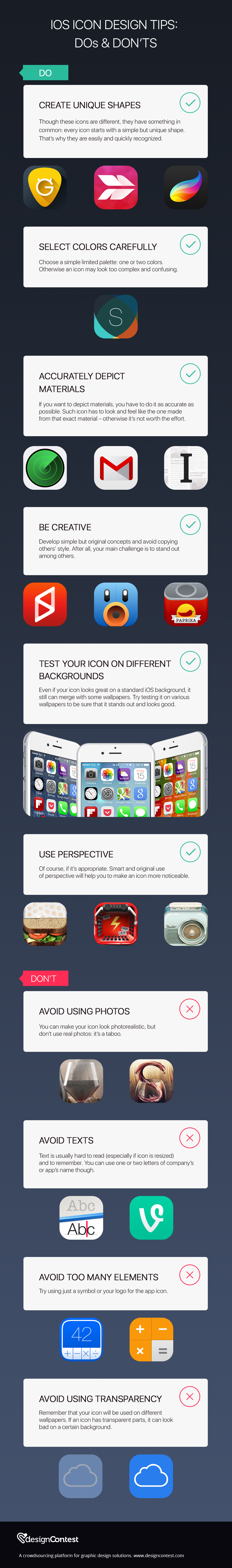
Apps icons are the first thing people see when they visit the App Store. If you want your app to stand out among others, you have to be sure that the design of its icon is good and unique.Â
In order to create such designs (or to evaluate the quality of designer’s work) you need to know about few basic Dos and Dont’s of iOS icon design.Â
DO
Strive for uniqueness and simplicity: your icon doesn’t have to be too complicated to stand out. Remember Gmail or Apple Music icons? They are very simple, but they look good and give users perfect understanding of what these apps are used for.
To create simple yet good looking icons, choose simple shapes and a limited color palette and don’t be afraid to use creative approach. You can experiment with perspective if you think it’s appropriate, develop original ideas and even use various materials in icon design (but be sure that you depict them accurately). Don’t forget to test final version of icon on different backgrounds and in different sizes to be sure that it definitely looks good.Â
DON’T
All iOS icons are used in various sizes (even in very small ones), so it’s important for designers to avoid using many elements, texts and photos (the last ones can look good in small sizes too, but are considered a taboo). Remember that you have to create an icon, which will represent the essence of the app, not confuse customers. You should also avoid making some of icon’s element transparent as the icon will be used on different backgrounds and so can look bad on some of them.


![RGB vs CMYK [Infographics]](https://dc-prod-blog.sfo2.digitaloceanspaces.com/uploads/2015/10/featuredimage.jpg)