Logo redesign means a change or a modification of an existing logo in accordance with the new needs. A must-follow rule for a logo redesign is to keep the brand recognisable, almost identical. Redesign is a rebranding strategy.
Sometimes a logo becomes a cult image. Who doesn’t recognize a peacock logo from NBC? Or the world renowned “M” for Mcdonald’s? And what about the three ellipses in the Toyota logo? Well, sometimes the opposite can also happens. For instance, Pepsi spent $1,000,000 in 2008 for  logo redesign and nothing much has changed.
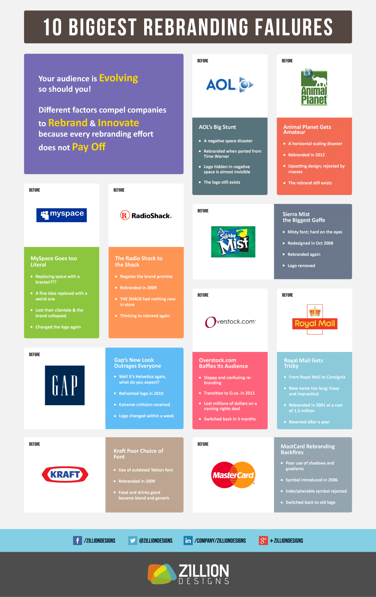
Even cult brands can fail with their redesign choices. We offer you an infographic with unsuccessful examples of redesigning. Let’s analyze their mistakes.
Â
Source: http://visual.ly/10-biggest-rebranding-failures-learn