

Color is just one of many tools that can identify your brand.
It can be from the use of a single consistent hue, or a scheme of multiple colors. But most of the brands with strong color ties are those that use one dominant color.
In this case study, we’re going to look at six different color outlines and how they connect to brands. For each color, we’ll look at a well-known brand and how it uses color, the overall impact and how you can choose a color for your brand.
Red
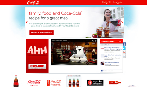
Coca-Cola is likely the most widely-recognized brand in the world that uses the color red.
The brand has stuck with the same color and uses it with only black and white, making the color – even without the logo present – symbolic of the soft drink giant.
Red works here because the color activates the senses, evoking people to act. (In this case drink a Coke.) Red because of its associations with energy, attention, passion and activity make this an excellent choice for a food or beverage brand. There are even some research studies out there that connect the color to hunger, making it also a popular choice for other types of food-related businesses.
Blue
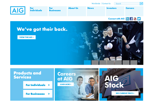
AIG Insurance wants your to trust them; blue is the color that most strongly associates with that idea.
The insurance giant has used a color (and combinations of blue hues) that visually connect to a sense of reliability and dependability. The color is a strong choice, but may not set the company apart from other insurance groups because blue is a dominant branding color among insurance and financial institutions.
Yellow
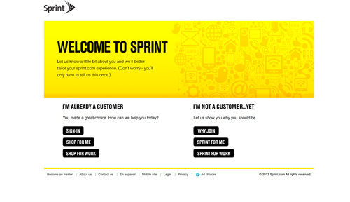
Sprint, a mobile phone service provider, uses yellow to set itself apart from all of the other companies in a somewhat crowded market. (Notably companies in this industry use a wide range of colors to represent their brands.)
What Sprint does with yellow as a branding color is makes people stop and look. The color is bright and positive and makes you associate in a warm and engaging way with the brand. The color choice represents creativity (or innovation in the case of a technology/communications-based business) and optimism. What Sprint is trying to communicate is that they are a brand that you can connect with in a postive way and you will notice the company as much as you are noticed using their brand.
Green

John Deere has become famous for its use of green. The brand and color association were event the inspiration for a song, “John Deere Green†http://www.youtube.com/watch?v=8gSJtYae8bQ by Joe Diffie that spent time in the Billboard Country Top 10 in the 1990s.
That’s definitely the way you want color to work with your brand. Not only is a color green; it’s John Deere green.
Further, the color is a natural choice for this business because of what they do. John Deere makes tractors and lawn equipment, which relate green’s most common color association – nature.
Orange
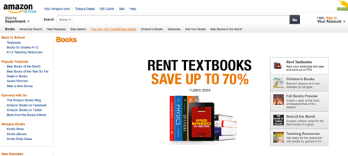
Amazon.com’s orange smile is part of the world economy. The simple curve is the one of the most well-known instances of orange brand identity outside the orange juice industry.
The color is fun and playful and makes you want to stick around and enjoy what you are seeing on the site. The color, which is made from red and yellow, combines attributes of each to evoke feeling of boldness (Amazon likes to tout itself as a innovative retailer) with energy and life (you can buy anything you might need from this company).
Multi-Color
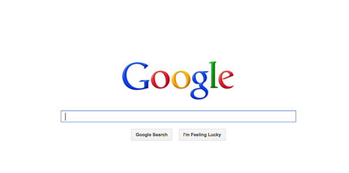
Google is anywhere and has everything you might ever need. That’s what the multi-colored palette and logo communicate to users.
While multi-colored palettes can be difficult to use and make part of an identity, a few companies including Google have mastered it.
The use of four distinct and basic colors – blue, red, yellow and green – communicate just that. Google is easy to use and basic. The multi-colored identification strategy communicates diversity in content, use and application as well. (All things that the search engine giant are known for.)
Ways to Use Color for Your Brand
Now that you’ve seen some great ways major companies are using color as part of their branding scheme, how can you use this every day?
It’s easier than you might think.
As a designer, you should consider how you use color for your personal brand, just as companies use color for corporate branding. Contest holders should consider how a color choice will stick to their company identity for years to come when settling on a logo or website design.
Here are a few ways to use your branded color:
- Use it as the dominant color for your website, blog and logo.
- Use your branded color in all personal materials – resume, social media cover images, Twitter background and business cards.
- Incorporate the color into visual presentation materials, such as slides or YouTube videos.
- Use the same color for all your business tools and giveaway items, such as iPad or phone covers, pens, folders, etc.
- Use your color as a background for images such as head shots, or on the backs of business cards. Also if you plan to distribute shirts or other items, get them in your color.
Color and Branding Infographic


![RGB vs CMYK [Infographics]](https://dc-prod-blog.sfo2.digitaloceanspaces.com/uploads/2015/10/featuredimage.jpg)
