

These are exciting times in the world of design!
As we enter a bold new decade, creators and designers all over the world continue to do everything they can to grab the attention of their increasingly distracted audiences. With the bulk of viewers’ attention being on text, choice of typography and font pairings play a key role in content effectiveness.
Font pairing involves the combination of multiple fonts in a single design project. Together, the fonts must convey harmony, while each having their individuality. Fonts should be chosen to complement each other, with the goal of directing viewers’ attention to the content’s message. Successful font pairings do not distract the reader by having each font vie for individual attention.
In this article, we look at some pairing trends already gaining popularity at the beginning of 2020!
Bold, High-Contrast Serifs with Heavier, Rounded Sans Serif: Storytelling with a Modern Twist

As industries around the world make the increasingly popular pivot toward all things digital, many find themselves yearning to go back to a more “human” time before technology ruled our lives.
And what is more humanizing than storytelling?
2020 is seeing organizations of all sizes reach for design options that humanize their brand by telling a story about them.
While sans-serifs have been popular due to their “modern” appeal, brands are trending towards the more “rooted” serifs to convey their stories.
This stylistic shift also includes increasingly mixing heavier, rounded fonts with bold, high-contrast serifs.
Handmade Fonts/Outline Fonts + Stabilizing Sans Serifs: Reflecting the Rebellion of the Streets
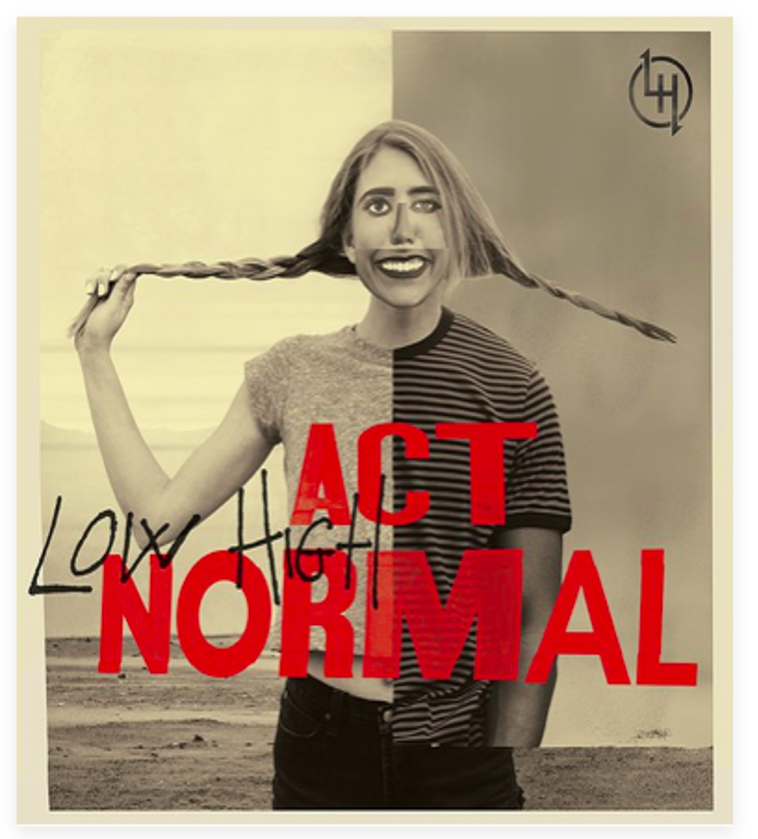
Every day, bold new voices and stories of individual activism break through the noise and into our newsfeeds. It was only a matter of time before this rebellious spirit spilled over into the world of design.
2020 is already seeing bold colors, street art, and cyberpunk being included in brand designs. It’s safe to assume their inclusion in typography trends is not far behind.
Some pairings in this style you may be familiar with include hand-made, decorative fonts contrasted with stabilizing sans-serifs or outline fonts contrasted with bold, attention-grabbing text.
Outline fonts can rebel against all the traditional rules of readability while still ensuring that the key message is contained in the filled text that accompanies the outlined text.
Bold designers have also increasingly been making use of maxi topography, where the text gets so large it bleeds out of the page! While maxi typography draws attention to the design itself, the text that needs to be read could be of a smaller, sans-serif type.
Corben with Nobile: Moving towards Warm and Happy Designs
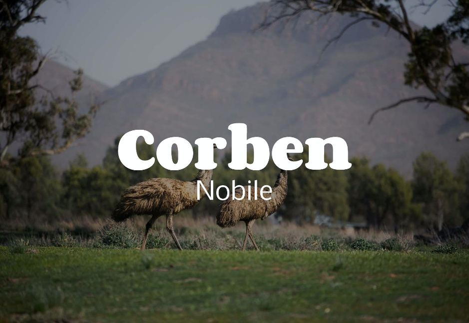
Consumers increasingly seek out warmth and genuineness during their interactions with brands. In this scenario, a type-only approach is often seen as sincere and genuine.
While flat designs with easy-to-read type will continue to be used, 2020 is already seeing a shift from cold, flat designs towards the cozy and warm.
The combination of Corben, a rounded serif, with a simple, slim font like Nobile brings a tone of “happy days” to any design.
Yellowtail + Open Sans Light: Calming, Organic, Natural, Honest
This year has also brought a love for earthy tones – designs that replicate the natural world through soothing, humanizing elements. The aesthetic has grown from being primarily used by natural food companies, farms, and similar enterprises to a top choice among brands from various spaces.
The Yellowtail script font lends an earthy appeal to designs. It is legible even at smaller sizes and has a very unique look. Yellowtail contrasts beautifully with Open Sans bold and Open Sans light.
The organic aesthetic also refers to the usage of irregular, uneven, “imperfect” elements in design.
One notable example in this style is the typography on Uber‘s website – rounded sans-serif, paired with text in subtle tones.
By investing in designs that are more natural, human, and approachable, brands are trying to give consumers what they’ve always yearned for – genuineness, honesty, and sincerity.
Courier New + Novelty Font: A Brutalistic Rebellion
When vintage-inspired TV show Stranger Things became hugely popular in 2019, marketers discovered the power of nostalgia in brand storytelling. Inspired by a number of earlier decades’ designs, typography and font combinations are seeing the return of pixel art, art deco, and neon.
While two retro fonts might be overdoing things, paring a retro font and a modern sans-serif is a perfect complement.
Courier New, for example, is a monospace font that can look raw and deliberately haphazard when combined with a novelty font – a rebellion against everything that’s organized and artificial!
Fonts and font pairings tell stories. They help humanize brands. They bring the natural world into designs. They help convey the mood of the times we live in. They make us ache for the past, while also helping us stay rooted in the present. Sometimes, they even help us escape to a surreal future! With the right combinations, font pairings can have a significant, positive impact on the power of a brand.


