
![Why Clean Typography Matters [Part 1]](https://dc-prod-blog.sfo2.digitaloceanspaces.com/uploads/2013/06/Damask_Typography_Wallpaper_by_littleboxofideas.jpg)
The biggest mistake designers make is forgetting about the words.
They pick a great palette of colors and fonts, select and edit images carefully and put it all together with precise detail.
And then there’s a giant, glaring hyphen in the middle of the design.
Bummer.
Paying particular attention to and creating clean type for projects – logos, print, websites or digital design – is vital. Good, clean typography sends the message that you really care about your work. It adds to the overall harmony of the design, and most importantly, makes it easy to read.
Here are five things you need to know to help create clean typography – hyphens, alignment, spacing, headlines and hierarchy.
1. Avoid hyphens
Want your text to look better immediately? Turn the hyphenation off.
There’s no need for these marks — aside from maybe books or newspapers – unless you are doing it intentionally. That being said, you can get away with using hyphens in large blocks of small type if there are not too many of them.
Hyphens, though, really should be avoided in logos and big type – headlines, navigational tools, etc. Think about all of the best-designed items you can: How many include hyphens in large type?
Why it matters: Hyphens break up the flow of reading, and they are pretty ugly when it really comes down to it.
2. Alignment matters
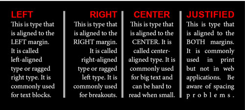
When it comes to setting type, there are four options: Left, right, center and justified.
Left-aligned type is the most common and easiest to read when it comes to large blocks of text.
Right-aligned text is the most difficult to read in large blocks but can be a popular option for smaller applications. (It is also the preferred choice for languages that read from right to left.)
Centered text is another popular option. In instances of minimal text, it can work well, but does cause some concerns when it comes to readability.
Justified text can be tricky. Text aligns to both left and right margins. Be very particular about text specifications when working with justified type because it can leave loose gaps in one line and feel incredibly tight in the next line. (This type of text alignment is often reserved for print publishing, such as books or newspapers.)
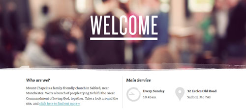
Left-aligned text can work for almost anything. Centered text is a popular option for big words such as headlines or banners and logos. Right-aligned text is idea for accents – block quotes are a common and practical use of this style.
Why it matters: The flow of text is key to reading. Starts and stops should be logical and easy to find so that readers don’t get tired trying to read.
3. Pay attention to spacing
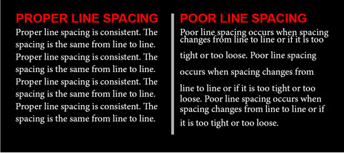
When it comes to spacing there are two terms that you need to know – leading and kerning.
Leading (pronounced ledding) refers to the space from baseline to baseline between lines of text. It can also be called linespacing. Standard leading specifications are typically based on the point size used to type but can be changed based on use. Leading specifications vary greatly by type style and project. In blocks of text leading is typically greater than the point size. For print, that range is typically 100 to 120 percent of the type size; that range increases to 140 to 160 percent for digital applications. The thing to really keep in mind is consistency: Lines of equal size and weight should be spaced equally.
The horizontal space between a pair of letters (kerning pair) and change of that space is kerning. Pairs are kerned to add or remove space so that letters look evenly spaced despite their shapes. AV is a common kerning pair. Properly kerned type will not have large or unusual gaps between letters, with even spacing throughout. While kerning is universally important, it is the most vital in the creation of big lettering, such as logos. While it may not always be easy to see properly kerned type, it is quite easy to feel when it is not. Make sure letterforms fit together in the way you envision them by kerning pairs and creating a defined set of kerning specs for specific text items such as a logo or website banner.
Why it matters: To much or too little spacing is hard on the eyes. By maintaining proper proportions in terms of spacing, you make it easier for readers (and users) to understand copy.
4. Headlines should fill lines
In terms of web design, this one is a little tricky for sites using responsive design.
When it comes to print, there’s no excuse not to follow this rule: Headlines should fill lines.
Why?
Because
text that reads
like this
is just plain annoying.
By writing to completely fill spaces when it comes to big type (almost anything bigger than body text), you create better visual flow from one line to the next and make everything easier to read. Newspapers and magazines have been doing this for decades.
When writing for the web keep this in mind as well. If the site has a fixed pixel width, write to fill lines completely. (Whether it is one line or more, each should be filled.) Writing headlines that fill for responsively designed sites is much more difficult. The key is to test text in a variety of popular environments to see how it will look and read. If something is jarring or hard to comprehend, try again.
Keep this in mind when it comes to big type and occupied space in general. Try to avoid trapped spaces that can leave text hanging or have an awkward look.
Why it matters: The way text breaks has an impact on comprehension level. Consider natural pauses as places to break lines of big type.
5. Establish hierarchy
Readers should know what’s important on a page, business card, website or even within a logo design by looking at it. Type can serve that purpose with size.
Establish hierarchy with the size and weight of type. The most important things should carry the most weight and should flow to the least important text. Make sure type styles include plenty of variance from one item to the next. Setting type in 24, 22, 20 and 18 point type won’t make an impact; consider 60, 45, 30 and 15 instead.
Why it matters: Readers can be lazy. They want to be told what’s important and that’s why big type does. It screams “look here!†Make sure to design the most important text with this idea in mind. Your logo or banner should always have visual weight, followed by headlines or headers, other important breakout text, navigation and then body copy.
Want to learn more?
There’s even more to creating clean typography. Check back soon to learn about proper punctuation, relative size, smart quotes, color and contrast, and readability. Learn more about typography in a previous Design Contest post, Typography Words You Need to Know.

