Question of the day:Â Why do Guinness, Hermes and other big companies use the same font in their logos?
The creative director of Depot WPF, Aleksandr Zagorskii has provided us with the most eloquent answer.
One could say there is no universal equation on how to design a logo (sadly). A systematic approach to logo design would defeat the whole point of branding and eliminate the creative process altogether. However, it is also true that there is a universal equation for creating a poor logo design that will be considered a cliche.
The whole point of branding is to create a trade mark that will distinguish a company from it’s competitors. Therefore we’ll disregard the second statement and stick with the idea that there is no one universal equation but there is a universal font that will give you the ‘=success’ at the end of whatever equation you’re using.
Font: Helvetica
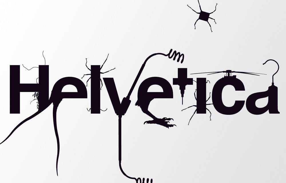
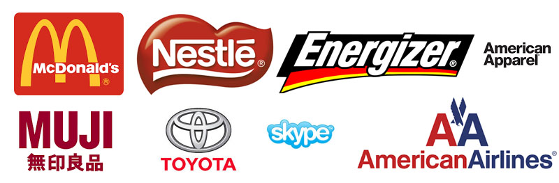
Professionals all agree that the fonts used in graphic design are divided into two categories – Helvetica and all the rest. Surely, you are familiar with the font from the logos of McDonalds, Nestle, Energizer, Muji, American Apparel, Toyota, Skype and many many others. It’s all variations of the same font.
Helvetica is perfect as it is, and designers have built on it’s greatness by adding their own stylistic elements.
Why Helvetica Dominates the Graphic Design World
First of all Helvetica is a flawless, well-balanced font type. It holds a perfect balance of white (the space inside and outside the lettering) and black, which is why any combination of words in this font appear beautiful and polished.
The font is harmonious and neutral – the two qualities that have made it so popular.
By default, Helvetica dominates all other fonts. It’s perfect for logos with global corporations as their objective is to be liked by all. It’s easy to blame a global company; unfair business, harming the environment etc. This is exactly why they must appear ‘friendly’, without any bold characteristics, neutral, effective and accurate.
Due to such wide and frequent use by international corporations, Helvetica has been dubbed ‘the font of capitalism’. Although this has a negative connotation, for a font of this reputation it is flattery of the highest regard.
Secondly, this font was created in the 60s-70s. In that time period, Helvetica was considered the most fresh and progressive among all typographic fonts. Helvetica was trendy, carried a great tone and was considered very innovative from the point of view of corporate branding.
In this period of post-modernism, the brands from popular trade marks morphed into love-brands as we know them today. The logos created half a decade ago are now living tributes to our favourite brands. A change in logo design for a company on this scale is a serious decision that can only be justified either by an updated strategy of the brand or a change in its values.
Lets get philosophical!
Let us explore the topic of how companies make such decisions – the requirements for predetermining the choice of logos according to Aleksandr Zagorskii.
Characteristics of a Font
A font firstly and most importantly translates an emotion; a word acquires a personality of the font it is written in.
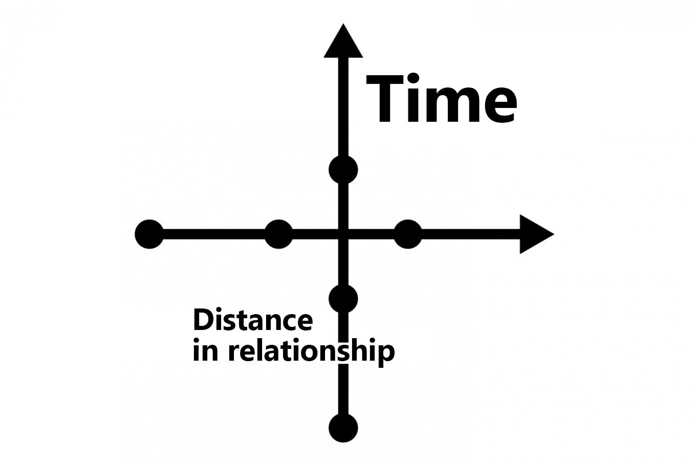
According to Aleksandr Zagorskii, two impressions help decide – time and distance in relationship. If words carry the meaning, the font embodies the emotions, the soul of the meaning. There is a slight contradiction here. It appears that it is the font we look at first, that stands out in it’s form, that embodies the point of the message.
In real life, everything appears completely different. People don’t really think twice about it: they see the font and don’t concentrate on the message behind the word/words, and the font slips his sight. But the first impressions of a brand that resonates with him is created solely by the font.
Designers, good luck! You have some big shoes to fill.
Brands and time: tradition, timelessness, perspective
On the vector of time, Aleksandr Zagorskii highlights a few points of characteristics with which the brands correlate. The earliest one is tradition. In this case, the brand speaks of itself as the carrier and keeper of ancient family traditions.
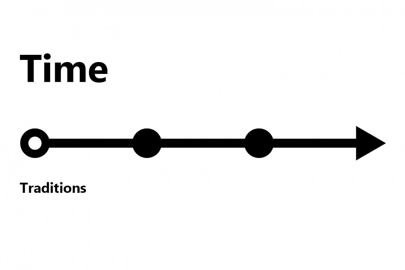
This is a particular characteristic of the ‘luxury’ category: expensive watches, jewelry, alcohol. For brands in this category, it is vital to use ‘historical’ fonts with their own stylistic features and indicators of time.
![]()
![]()
![]()
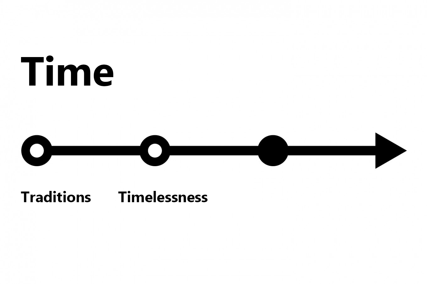
The middle point on this vector is timelessness. Almost all brands want their logo to be timeless. This is of particular concern to those that change their positioning, and afterwards their logo (Logitech), as well as those that redesign their corporate style and change their identity and communication.
![]()
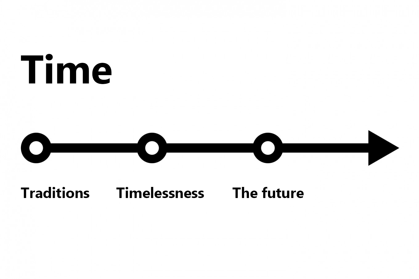
The last point on the vector is the future. Innovative companies, such as Apple and Tesla, are superbrands on the highest pedestal of love and adoration. Microsoft was also heading in a similar direction, the brand would really like to be all about ‘the future’, which is why it’s been plagiarising Apple.
Burn.
With this example of the new logo for Windows, we can see that the company has chosen to comply by the rules of the game. The old and bold font known by all (Helvetica Bold Italic) seemed like the timeless logo, has been replaced by a lighter one – Segoe.
![]()
![]()
![]()
Relationship with consumers: friendly, neutral, distant
The second dimension we will talk about relating to the characteristics, is the distance in relationship. What is meant by this statement, is the relationship of the brand to the consumers; how close they are, or how cold and distant or perhaps perfectly neutral and mutually beneficial.
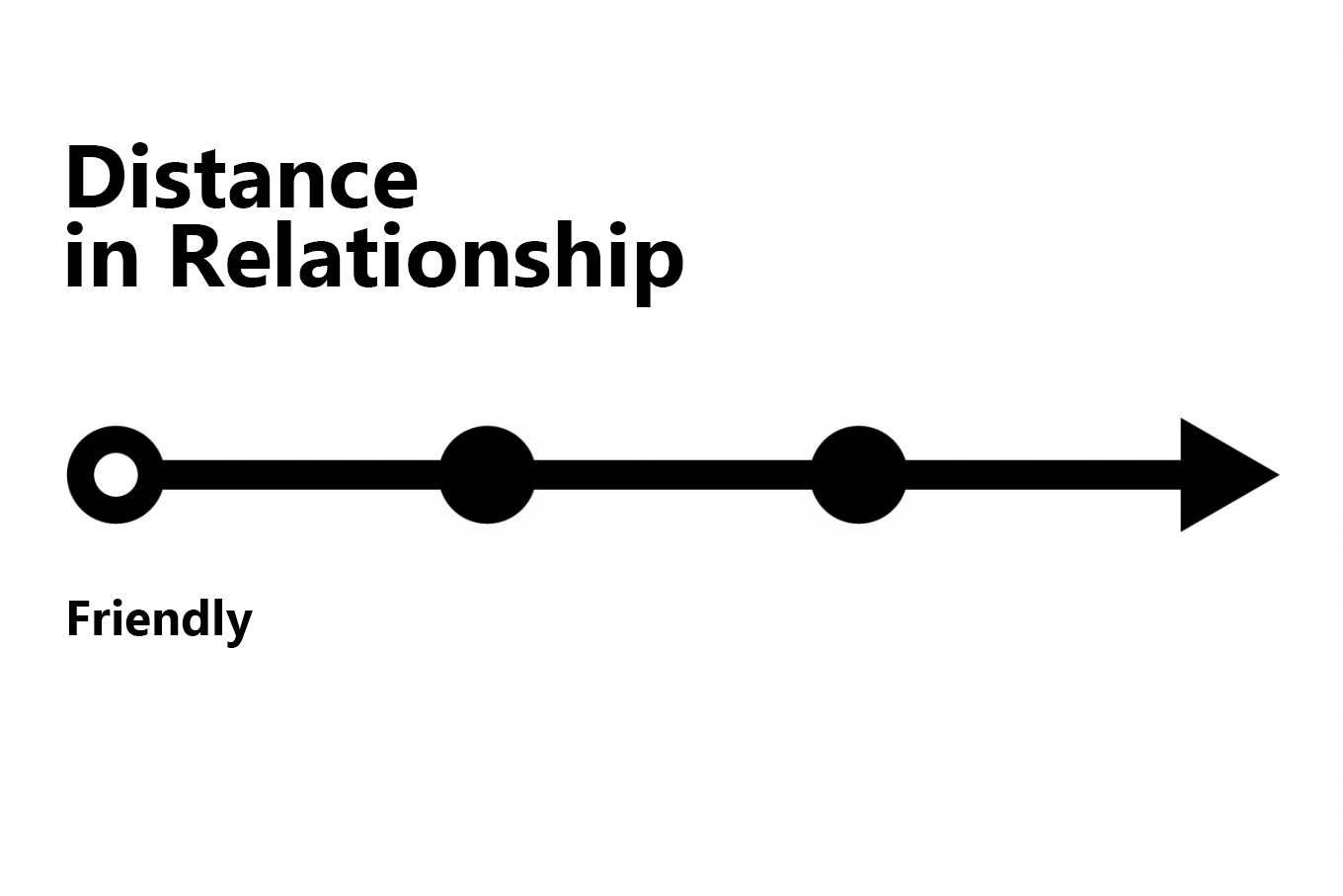
Some brands aim towards creating as close a relationship as possible with their users. Ray Ban, H&M, Coca-Cola all say the same thing with their logos; “I’m a friend, practically a sibling, a member of the family”. In this category we see simple, unartful scripts and cursive.
![]()
![]()
![]()
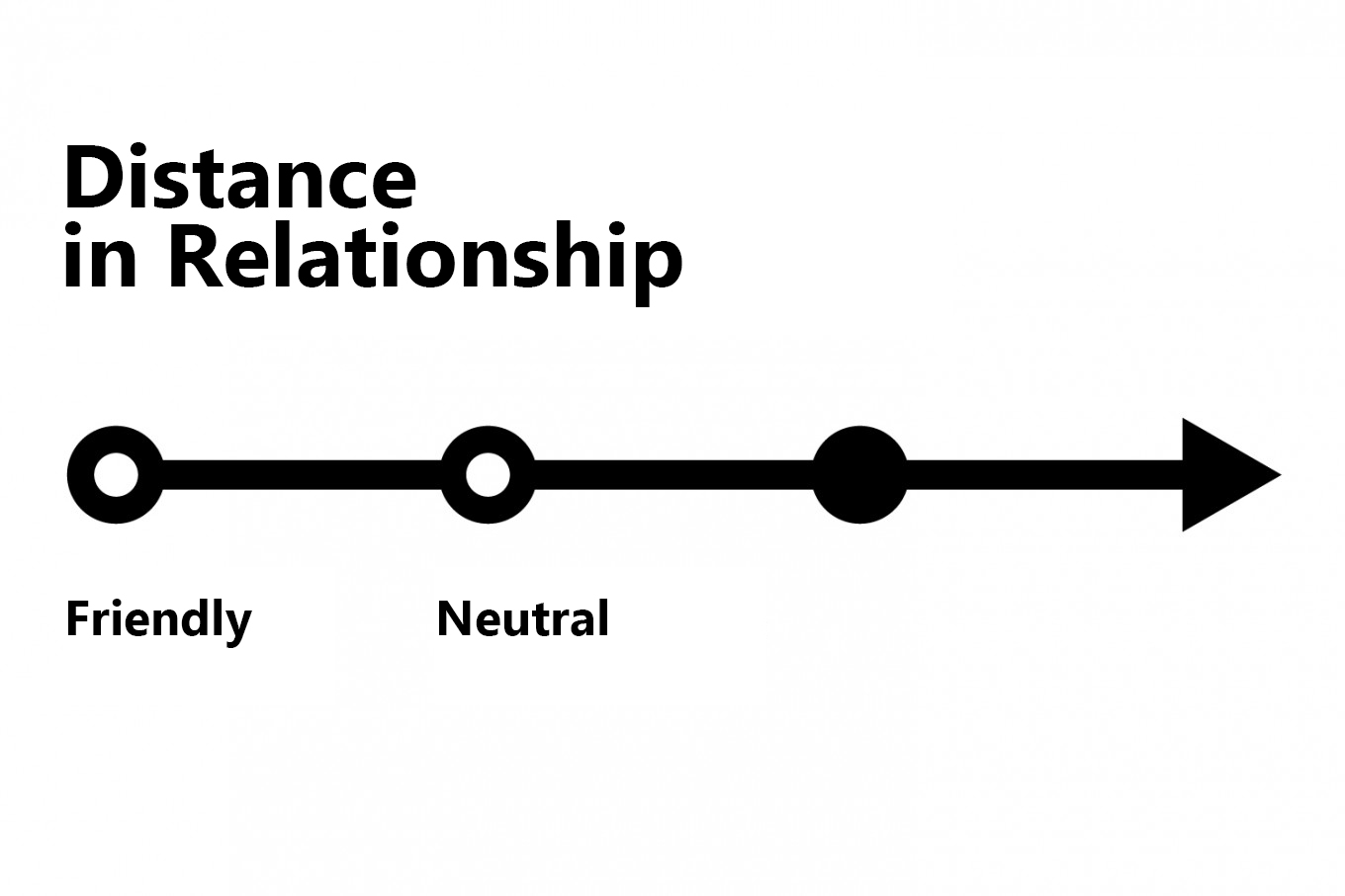
Neutral brands can be compared to an acquaintance. You cannot categorise this person as your friend, as you cannot stand to be around them everyday. For almost all of them, Helvetica is the font of choice.
![]()
![]()
![]()
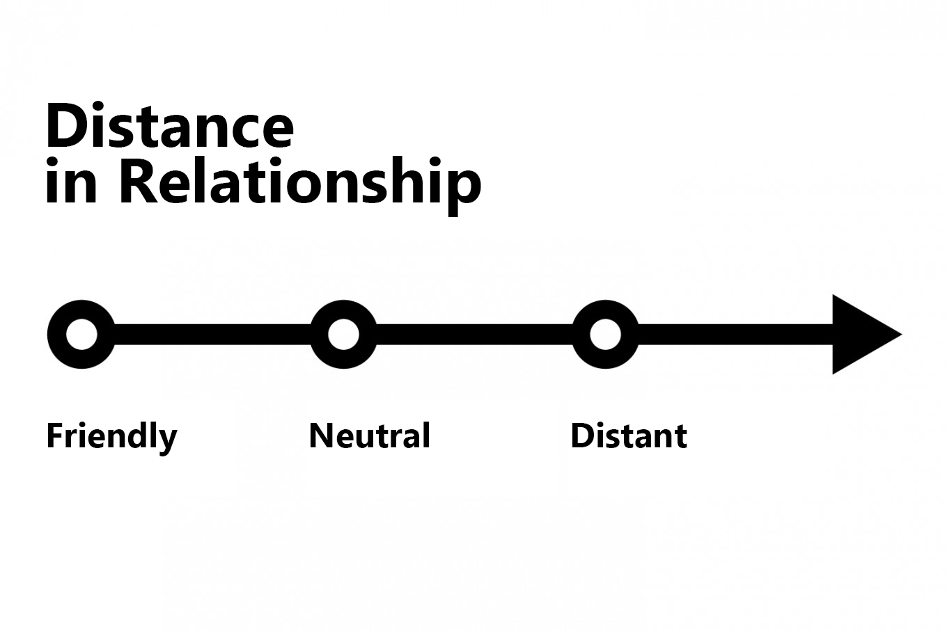
There are brands that prefer to keep their distance – it is a far off point that is located at such a far away distance that the brand feels like a stranger. This position is a characteristic of local, niche and very subcultural brands or products.
![]()
![]()
![]()
The brand’s character is formed based on their orientation on these two vectors – time and distance of relationship. Once the character is determined, one can pursue looking for the right font that will mirror this character in the most effective way.  Without an understanding of the brand character, designers are doomed to eternal torments of ‘playing with fonts’.