
GoDaddy is one of the most well known and established internet companies. Since 1997 GoDaddy has become the Go-to website for getting your domain names. Now, in 2020, the brand has evolved into much more. From web hosting to website builder products to new domain endings like .xyz, GoDaddy has expanded into many additional small business product lines in order to propel all elements of an online presence. As the company has evolved in its business offerings, so has its branding. To begin, let’s have a look at the old and new to achieve a visual comparison.
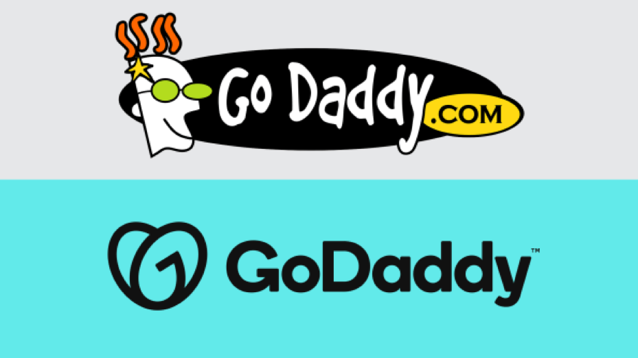
At first glance, there seems to be little connection between the two logos at all, except the super sticky high recall name. The two logotypes might as well belong to two different enterprises, originating from opposite corners of the world, oblivious to one another.
The evolution of the GoDaddy logo to what it is today covers color composition, font, style, and symbol to appear as a reincarnation of sorts. They’ve dropped the .com since everyone who needs to know, already know what it is. The elder-looking Fido Dido caricature has been replaced with a simple unending line symbol that presents a store of interpretations. The color variations are entirely modern and fewer while the font is a more serious serif that means business.
Since the company’s inception in 1997, the brand has seen many changes and acquisitions. Each business move inspired a slight variation to the brand positioning and therefore, logo. For example, the center logo, among the 3 above, was born in 2018.
But that’s all in the past…
What interests us now is the latest GoDaddy logo which is such a welcome change from the former ones. And here’s exactly why:
The Real Deal
There may have been a time when GoDaddy needed an “out-of-box” logo idea to attract the right entrepreneurial clientele. But no longer…
Today, Godaddy has tens of millions of customers, globally. Over 20% of the domains registered on the www are registered by GoDaddy. Their success speaks for itself. Hence, they are able to assume a more confident, though somewhat out-of-your-face (opposite of in-your-face) stance.
It’s sophisticated and suave. A fine job is done by GoDaddy internal creative whizzes and not one, but two agencies – Lippincott and Koto.
One GoDaddy spokesperson stated that the oval-ish logo, according to him, represents a cheeky, rebellious young gal who dreams of being a success one day. This is a typical depiction of their “Everyday Entrepreneur” positioning that still stands strong, sans zany caricaturist embellishment.
Do What You Love!
Introducing GoDaddy’s softened, mentoring side! The logo may look like a girl to some but to most appears as it should – A beautiful heart… and it really shows how much they “heart” their clients.
Since it inspires and builds the target customer, that is a big bonus for the brand. When you have GoDaddy backing you, not much can hold you back!
The heart form also gives the brand a more approachable, human element. Due to its sheer size and popularity, there could be an unintended elusiveness that may get associated with the brand. (Eg: I’m not THAT good, why should I approach these guys?)
Well, when you turn up at someone’s doorstep with a cute little, rounded heart, walls drop, making the brand easier to get along with. Another reason why we think it works so well!
In Tune With The Times
Of course, the whacky font and guy had to go! No one today has the inclination or time to analyze characters and quirky fonts. We like it simple and straightforward.
Speaking of fonts, the new GoDaddy headline and typeface is a pretty bold and distinct serif that is definitely more professional-looking than the older versions. A fitting modern Sherpa that works well on the digital platform without compromising on brand values.
So as you can see… we love every element of the GoDaddy new logomark and we are convinced of its power to continue capturing the attention of small businesses worldwide.


